Chapter 3 Interactive Visualizations in Tableau
Tableau is a user-friendly application helpful in the design of interactive visualizations. We used this application to aid in exploratory data analysis of our data over time and to determine if there were any noticeably visible associations between variables in our metadata and the dynamics of our samples.
In each Tableau sheet created, hovering over a single point will cause that sample, as well as all other samples corresponding to the same patient, to be highlighted. This behavior allows us to specifically visualize how our samples’ distributions change at an individual-by-individual level. Figures 3.1, 3.2, and 3.3 include some examples of the plots designed in Tableau.
Figure 3.1 depicts an ordination plot, colored by Batch number, and connected by patient ID. The thickness of lines connecting points to one another increases as time progresses in the study. Hovering over a point will also highlight all other sample points corresponding to the individual, as well as the path representative of the selected patient.
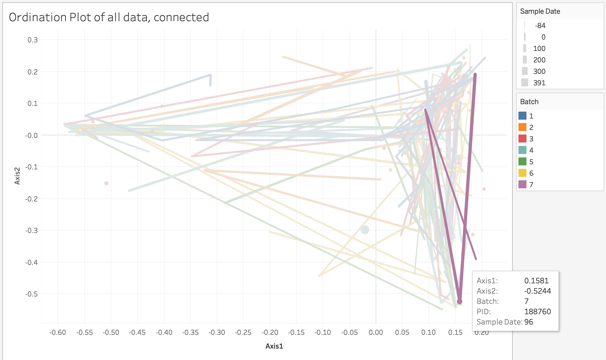
Figure 3.1: Ordination Plot colored by Batch Number and connected by Patient ID
Figure 3.2 shows plots of the maximum distance travelled by different patients, separated by whether or not their first sample date occurred before their transplant. It appears that patients with initial time points occurring before transplant date may have potentially higher maximum distances.
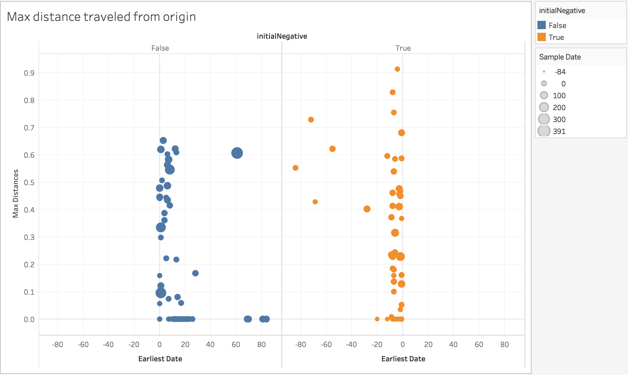
Figure 3.2: Plots of Maximum Distance traveled by Patient Microbiome
Figure 3.3 depicts two ordination plots colored according to the presence of acute graft versus host disease. The top plot depicts AGVHD values taken within the twelve weeks prior to transplants, and the second plot depicts AGVHD values taken within the twelve weeks after. Both plots can be manipulated to specify the desired time frame. This kind of visualization allows us to more directly compare the distributions of our covariates across different times.
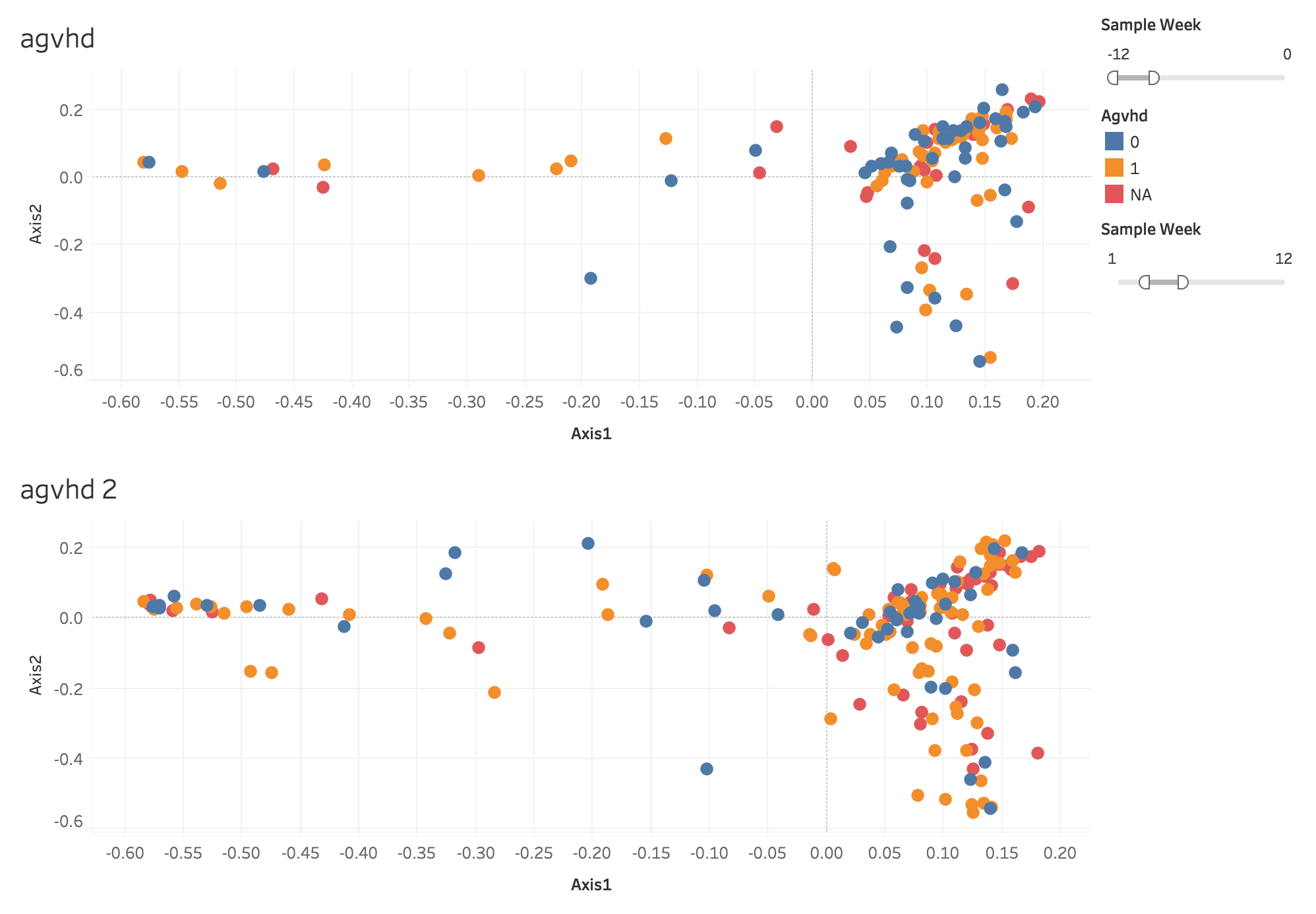
Figure 3.3: Ordination Plots colored by AGVHD, separated by Time
With our Tableau spreadsheet, we were better able to interact with our data and the metrics that we had devised. However, while these visualizations were informative, we were still unable to specifically quantify potential associations between our various covariates and the dynamics of the gut microbiome.