Chapter 2 Post-processing and Filtration of the Sequence Table
The ASV table produced by Alex Sibley consisted of seven different batches of stool samples produced by MSK. Characteristic of the typical OTU sequence table, these distinct datasets were merged into a single ASV table, with columns representing different ASVs, rows representing samples, and counts in the table representing the abundance of each ASV in each of our samples.
DADA2 was used to remove chimeric sequences from the sequence table by comparing each inferred sequence to others in the table, and removing those that could be reproduced by stitching together two more abundant sequences (Callahan et al., 2016a). The DADA2 naive Bayesian classifier was then used to compare sequence variants to the Ribosomal Database Project (RDP) v14 training set of classified sequences (Cole et al., 2014). Through this process, each ASV column was assigned a full taxonomy, including Kingdom, Phylum, Class, Order, Family, and Genus.
In addition to assigning taxonomies, we associated de-identified metadata, also provided to us by Memorial Sloan Kettering, to our stool samples. The metadata were imported, cleaned, and subsetted to match our ASV table. Finally, the R “phyloseq” package was applied to combine our ASV feature table, our metadata, and the sequence taxonomies of our amplicon sequencing experiment into a single object (McMurdie & Holmes, 2013).
With our full phyloseq object, we then used our assigned taxonomies as a filtering criterion on our data. This filtration process helped us to eliminate noise in our data by deleting taxa that were probably artifacts of data collection (Callahan et al., 2016a). We created a table of read counts for each Phylum present in our dataset (Table 1).
| Phyla | Read Counts |
|---|---|
| Actinobacteria | \(3.86*10^3\) |
| Armatimonadetes | \(1\) |
| Bacteroidetes | \(3.38*10^3\) |
| Chlamydiae | \(3\) |
| Cyanobacteria/Chloroplast | \(15\) |
| Deferribacteres | \(1\) |
| Deinococcus-Thermus | \(3\) |
| Euryarchaeota | \(2\) |
| Firmicutes | \(1.56*10^5\) |
| Fusobacteria | \(19\) |
| Proteobacteria | \(3.48*10^3\) |
| Spirochaetes | \(4\) |
| Synergistetes | \(84\) |
| Tenericutes | \(3\) |
| Verrumicrobia | \(8.82*10^3\) |
| Woesearchaeota | \(1.58*10^3\) |
| NA | \(2.11*10^5\) |
Many of our features were annotated with a phylum of “NA,” potentially indicating that they are artifacts. However, due to the fact that databases such as the RDP are often far from complete, filtering out all of these data points was considered to be too stringent. As a result, they were kept in our dataset.
We also explored feature prevalence in our data. Feature prevalence is defined to be the number of samples in which a taxon appears at least once (Callahan et al., 2016a). We computed the average and total prevalences of the features in each phylum to determine if there were any phyla that consisted mostly of low-prevalence features (Table 2). Through this process, we dropped the following phyla from our dataset: Armatimonadetes, Chlamydiae, Deferribacteres, Deinococcus-Thermus, Spirochaetes, and Tenericutes.
| Phylum | Average Abundance | Total Abundance |
|---|---|---|
| Actinobacteria | \(2.61\) | \(1.01*10^4\) |
| Armatimonadetes | \(1.00\) | \(1\) |
| Bacteroidetes | \(3.14\) | \(1.06*10^4\) |
| Chlamydiae | \(1.00\) | \(3\) |
| Cyanobacteria/Chloroplast | \(3.13\) | \(47\) |
| Deferribacteres | \(7.00\) | \(7\) |
| Deinococcus-Thermus | \(2.33\) | \(7\) |
| Euryarchaeota | \(2.50*10^{1}\) | \(50\) |
| Firmicutes | \(1.95\) | \(3.04*10^5\) |
| Fusobacteria | \(4.47\) | \(85\) |
| Proteobacteria | \(3.38\) | \(1.18*10^4\) |
| Spirochaetes | \(1.50\) | \(7\) |
| Synergistetes | \(1.88\) | \(1.58*10^2\) |
| Tenericutes | \(2.33\) | \(7\) |
| Verrucomicrobia | \(1.71\) | \(1.51*10^4\) |
| Woesearchaeota | \(3.15\) | \(4.97*10^3\) |
| NA | \(1.98\) | \(4.18*10^5\) |
The previous filtration steps all depended upon our taxonomic annotations. Ignoring taxonomies, we used prevalence filtering as a form of unsupervised filtration to further streamline our data. We plotted graphs of prevalence against total abundance for each phylum in an effort to identify an appropriate prevalence threshold (Figure 2.1)
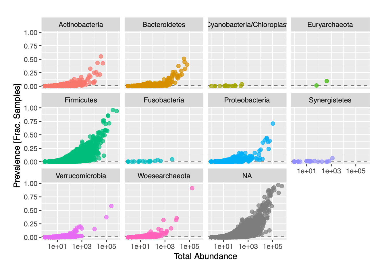
Figure 2.1: Feature Prevalence of Phyla against Total Abundance in our Dataset
We failed to see see any real separation in our plots, so we established an arbitrary prevalence threshold of 1%. In order to account for differences in library size, variance, and scale, we had to use relative abundances instead of total abundances. We transformed our data from counts to frequencies, and also applied a log transformation. We then applied Principal Coordinates Analysis (PCoA) with Bray-Curtis dissimilarity to our transformed data. PCoA was used over Principal Components Analysis due to the fact that our data had so many features (ASVs) compared to samples. We visualized ordination plots of the samples in our dataset, as well as of the distribution of taxa present in each sample (Figure 2.2).
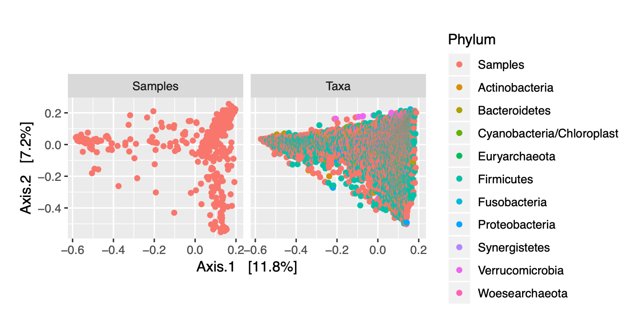
Figure 2.2: Ordination Plots of Samples and of Phyla
In addition to looking at the specific distribution of phyla for our samples, we can color-code the different data points representing each of our samples to determine if there are any obvious clustering patterns based upon the covariates in our metadata. Figures 2.3 and 2.4 allow us to visualize trends in vital status and graft source for our patients across all time points.
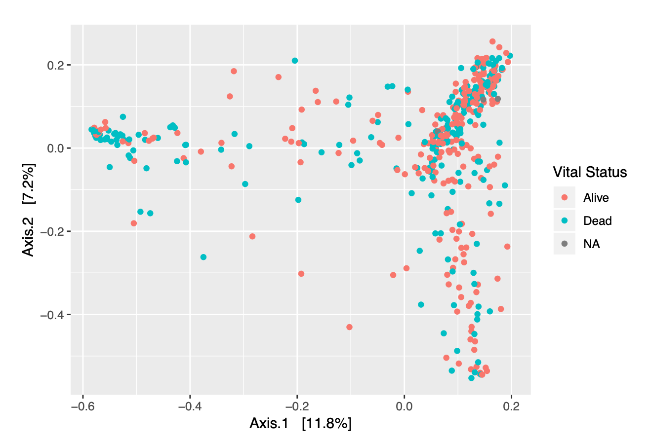
Figure 2.3: Ordination Plot of Samples, colored by Vital Status
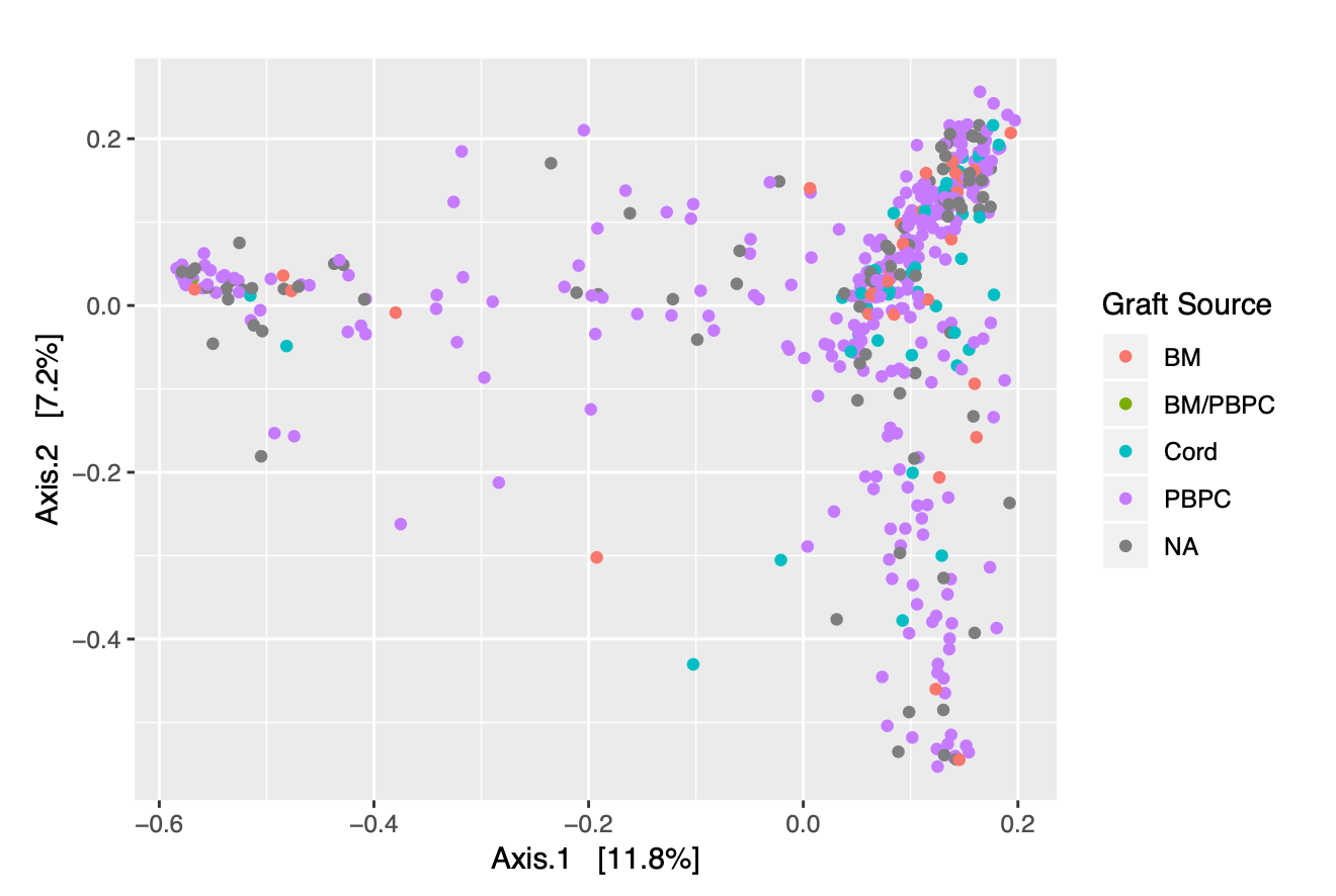
Figure 2.4: Ordination Plot of Samples, colored by Graft Source
A key issue with our plots is that we were unable to clearly identify how a single patient’s sample would change over time. To quantify the dynamics of a individual’s microbiome in our ordination plot, in consultation with Eric Monson of Duke’s Data and Visualization Services, we devised two different summary statistics: maximum distance and last distance.
Given an ordination plot, “maximum distance” is defined to be the largest two-dimensional distance traveled from the initial state of the patient’s microbiome. “Last distance” is defined to be the distance between a patient’s last and first points in the ordination plot. Both of these values give us a way to quantify change in a patient’s microbiome. The higher the value of the maximum or last distance, the more different a individual’s microbial composition is from its original state. We began by creating a Scree plot to determine the contributions of our different principal coordinate axes to our ordination (Figure 2.5).
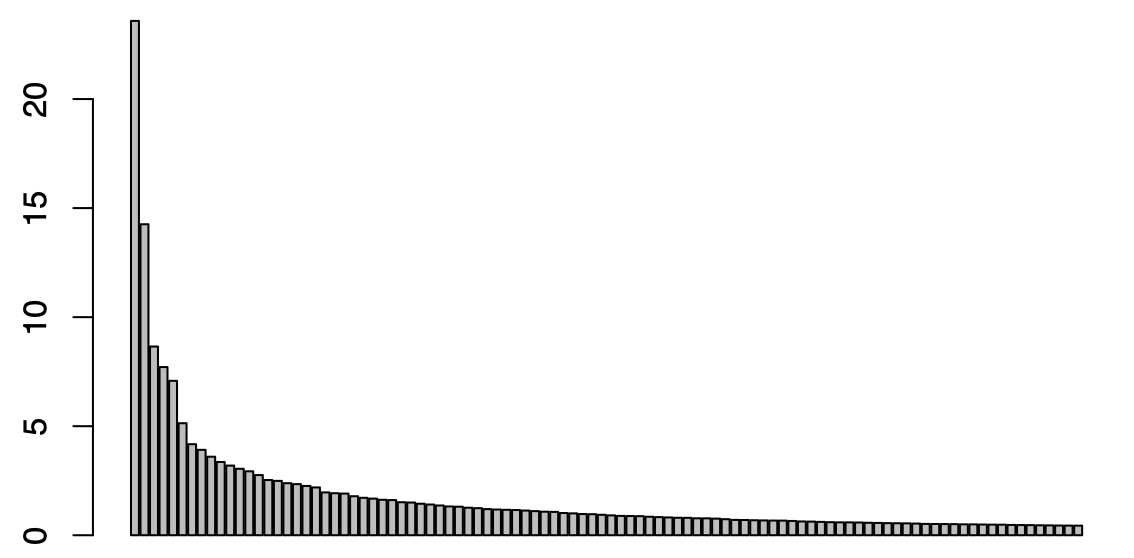
Figure 2.5: Scree Plot of Contributions from PCoA Axes
Analyzing the plot and computing the contributions of our axes, we saw that the first 17 axes constitute the the majority of contributions from our 460 total axes. So, we used these axes as part of our distance metrics; we calculated the distance from one sample to another by taking the square root of the sum of the squared differences of each of our seventeen components. A potential future avenue to explore in this scenario is to scale principal components relative to one another instead of simply using the first seventeen, in an effort to get a better quantification of our two metrics.
While the use of ordination plots in ggplot revealed some information into the distributions of bacteria in our samples, we failed to see any obvious trends across our categories. In an effort to better understand the behavior of our data in relation to our new summary statistics, as well as over time, we turned to the visualization application “Tableau.”