Chapter 7 Public Interaction
7.1 Data Accessibility
TRI data originates from The Emergency Planning and Community Right-to-Know Act (EPCRA). The bill was largely motivated by an incident at a chemical production plant in Bhopal, India. Approximately 40 tons of Methyl Isocyanate was released in to the air, killing upwards of 5000 people living in the surrounding area. The disaster created a panic in the United States, and created public demand for transparency on toxic releases in their communities.
Public use generally doesn’t extend to the full depth of TRI data, due to its size and complexity. Simple tools were developed by the EPA to allow public access to the data, including a map that allows you to click on a state and learn what number it is ranked in the US. Data available has incredible potential to allow access to much richer information on a much more local level. There is also an app that allows for investigation of RSEI data. Though quite thorough, it requires extensive setup.
The intent of this app is to allow an easier outlet to find information about local RSEI data, allow comparisons more complex than rankings, and introduce environmental justice concepts in the context of RSEI data.
7.2 App Intent and Description
The app built focuses on communicating the distribution of toxicity in a given local area as compared to the national and state distributions. The app was build primarily through Shiny (Chang, 2017). Additionally, it shows the difference in toxicity burden experienced locally by black communities as compared to white communities.
The priority in organizing the app was to provide as much information as possible in as intuitive a form as possible. To do this, we prioritized three pieces of information we found to be most useful for communities interested in their toxicities: a map of toxicities in surrounding areas, a plot showing the distribution of toxicities within their county, and the distribution of toxicities experienced by black and white groups within their county.
The app functions through a location search. By geolocating the given search address, the relevant data and plots will be shown.
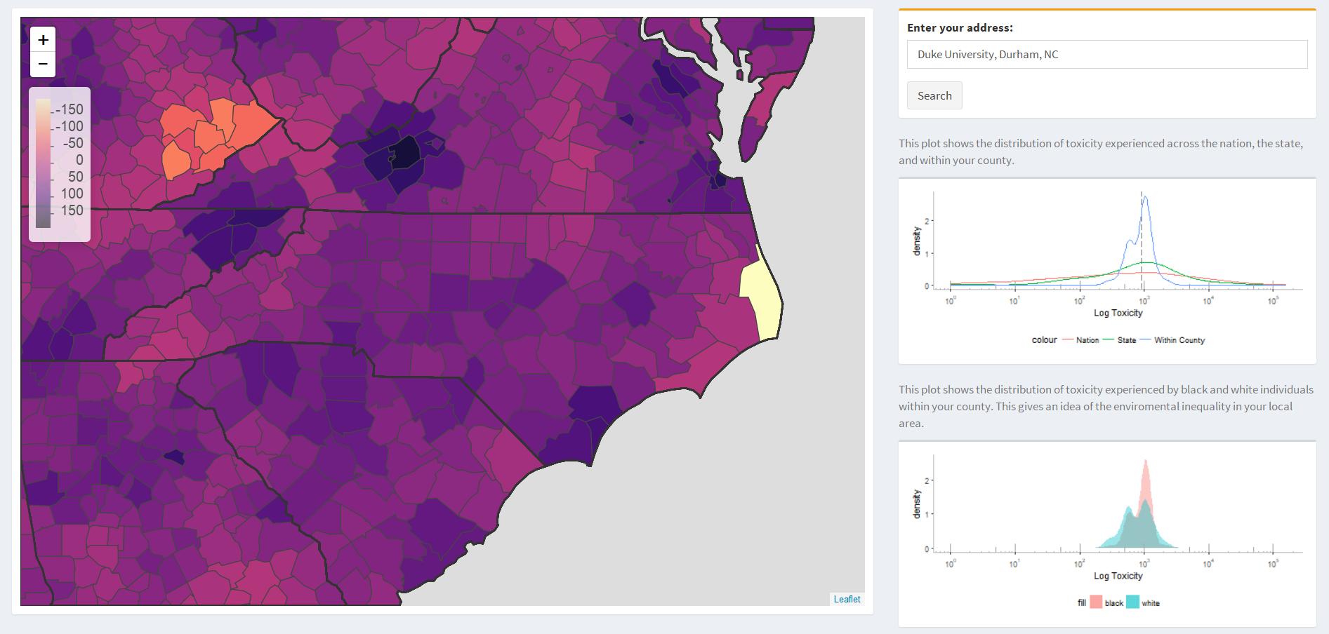
A choropleth map forms the centerpiece of the app, showing the average toxicity of counties in the area surrounding the point. This contextualizes the toxicity, which is unit-less and only interpretable in comparison to other toxicities. Choropleth maps are a familiar form of communicating location based data.
The second chart plots the distributions of toxicity experienced in the nation, the state, and within the county. This gives some additional context that the map doesn’t provide, showing how the state varies from the national distribution, and how the county differs from the state. This might convey interesting information in areas that are especially clean or dirty compared to their state overall.
The third, and last, chart is meant to convey the environmental justice themes discussed in this project at large. Instead of showing the distributions of toxicity experienced at different geographic levels, this plot shows the distributions of toxicity experienced by the black and white populations of the selected county.
7.3 Computational Limitations
RSEI’s origin lies in corporate accountability, and that may be an area that the public would be interested in accessing data for. Specifically, data on which companies are polluting locally, and which chemicals are being released might be useful. It would be possible to filter toxicity by many metrics, including the facility, and the specific chemical, but it isn’t computationally feasible as it would need to reference the 4TB of disaggregated microdata.
Feasibility issues also arise when attempting to use block group and tract data. Visualizing geography at that level is very slow to render, and makes the app too slow to be reasonably useful. Despite that, mapping at a county level still provides significant context to the toxicity measure.
7.4 Further Data Engagement
With the data publicly available, this work is entirely reproducible. To make that a more accessible process I’ve created a package, “rseiAnalysis”, that helps transform the initial disaggregated microdata in to consistent tract level estimates, and combines them with demographic data.
The package contains functions that will aggregate geography, transform data from demographic count to percentile of toxicity for each demographic, create plots of the CDF’s for each group, or simulate what distributions would have been given percentile placement stayed the same across time.